Some would say that bikes are art enough on their own. Others, that an ombre fade, a clean sweep single shade, rigid geometricity or playful abstraction only improve what is already an elegant form. We're in both camps. A raw steel or titanium frame is stunning in its simplicity. But when there are as many ways to paint a bicycle as there are styles of art, the pursuit of color is endlessly rewarding.
When it comes to deciding on a final look, building dream bikes has taught us the importance of being an experienced guide to our clients, filtering all of the many ideas and directions down to one true path, a creative direction that perfectly expresses what the client wants their bike to say and represent.
To do that requires an artistic partner who understands us, our aesthetic, our clients, our bikes and everything they represent. It's a big ask.
In the bicycle industry, two-wheeled artists abound, but few, if any, rival our friends in the north, VéloColour of Toronto. We've been working with founders, partners and artists Suzanne and Noah at VéloColour for several years to custom-finish client bikes because their work is exceptional, as is the sheer quality of paint and flawless attention to detail each frame exhibits upon its return to us at AC (interesting side note: VéloColour also make the AC saddle bags). They get us, and we get them, and an Above Category custom bike wouldn't be the same without their incredible creativity.
So imagine our surprise when we realized we hadn't ever featured VéloColour in our journal. In passing, sure, but not direct. To set things right, we jumped on the phone with Suzanne to hear how VéloColour came into existence, art, bikes and much more.
AC: Hey Suzanne, how are you doing?
VC: Good, thanks, Pete. Nice to speak to you.
AC: How's the studio today?
VC: Good - busy! I just got back from visiting my parents in British Columbia, where I grew up. The other day, I realized I'd lived here in Toronto longer than in B.C., which was a shock.
AC: How did you find your way to Toronto?
VC: I came here for three years of art school, then stayed because I got a residency here, and then I met Noah, my partner, who is from Toronto. We met through a mutual friend who said Noah and I were the only two people she knew who rode a bicycle year-round in Toronto, including in the snow, so she thought we had to meet!

AC: That's fun. And when did VéloColour start rolling?
VC: Noah started VéloColour in 2008, then I came on about 2012-ish.
AC: Noah is also an artist, right?
VC: He sure is. Noah did a college degree in ceramics and then went to university and studied sculpture, whereas I did a double major encompassing jewelry, metalwork, and then textiles - a lot of surface design and that sort of thing.
AC: How did you both get into the bike painting business?
VC: Noah had a good family friend, a custom bike builder. He knew Noah had returned to Toronto after attending art school, and he needed someone to paint his bikes. So that's where Noah learned the absolute basics of bicycle painting - on the job! That was a three-year journey.
My route was less bike-specific. After school, I had a jewelry practice. Before I formally joined the business, I rented part of what is now the VéloColour studio for my needs. Gradually, I started doing admin for Noah and helping to manage the space and customer communication. But then, because I have a surface design background and was already doing the initial communication with the customers, I started to do the design work and stencil creation to then pass on to Noah and now Elodie (our head painter), to execute.

AC: What sort of work were you putting out in the early days?
VC: Restorations were a big part of it. Noah won the best paint award at NAHBS in 2009 for a unique restoration, which gave us quite a bit of early momentum. Shortly after that, Noah started to dabble in more unique design work, experimenting with and pushing the limits of what our automotive paints and stencils were capable of. As my involvement increased, we started doing even more custom design work. It all happened quite organically.
AC: Would you say that a VéloColour-painted bike has a specific look?
VC: That's a tricky one. So much of what we do is in response to a customer's idea. I know people come to us, including AC, because they appreciate our aesthetic, use of geometry, attention to detail, etc, so the goal is to take a customer's idea and give it a VéloColour spin. I feel like we have a recognizable style, especially when customers give us carte blanche with design, but then again, some customers come to us with fully formed ideas, and we just execute the paintwork.
AC: Where do you look for inspiration for your custom design work?
VC: I think the best inspiration comes from outside of the bike world. We always encourage our clients to send us some inspiration, preferably not bike-related, so we can get a general idea of what they like. With my textile and craft background, I still return to my roots for inspiration, especially regarding patterns and color use. There's a magazine called Uppercase, a publication for 'the creative and curious', which I read regularly and is always full of good visuals and stories. Ultimately, inspiration is everywhere - fellow artists, historical objects, pop culture, nature, architecture. There's endless scope for creativity. That's what's so rewarding about painting or creating anything with your hands.

AC: What sort of bikes do you typically work on?
VC: We are super lucky to work on anything with two wheels! Whether new or used, we see road, gravel, mountain, tricycles, cruisers, and low riders. We've seen some pretty neat stuff over the years. There's a lot of variety, that's for sure. What we get from AC is usually pretty rarified - unique, handmade pieces with a clear art direction, either from the client or you guys. We feel fortunate to be working with you since all the projects are unique, and the trust/respect you have for us and our skills is pretty great.
Some of my favorite projects are older frames that are still going strong, like a Pinarello or an S-Works, where the customer still loves the feel but wants a wholly new look, something a bit more modern, removing the fifteen brand logos that were popular a decade or more ago etc. That's where we excel. Refreshing a frame to make it new, at least aesthetically, is a gratifying and fun experience. And then the bonus, for us at least, is seeing the whole bike come together when AC overhauls or replaces the components.

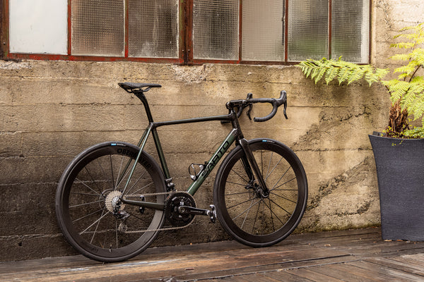
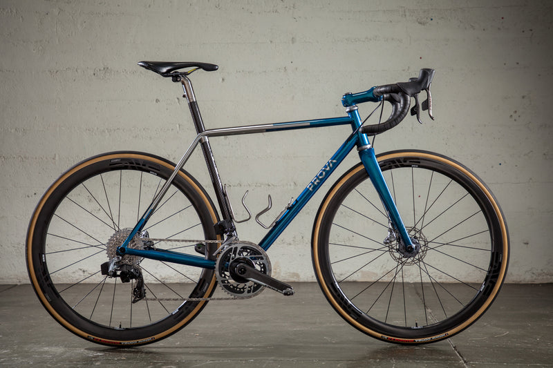
AC: Our most recent BOTW is a project you worked on, a Prova Speciale in mint green with a reimagined Prova logo. Can you talk about that?
VC: Unfortunately, I had nothing to do with that incredible logo! The customer of that bike has a good friend who is a type designer, who created that typeface based on, I think, a seventies kind of graffiti.


Before I knew the logo thing was happening, I had come up with a few designs for the general look of the frame. But as soon as he said his friend was making a new logo, I was like, "Oh, I need to see it because that's going to be what the whole design hangs on." Then, once I saw the logo, I realized that the paint scheme didn't need to do much because the design of the logo was so engaging. So I proposed the little detail on the fork, the fade to polished titanium. It turned out nice.
AC: Awesome. Thanks, Suzanne. It was an absolute pleasure talking to you.
VC: You too, Pete!



Back to Journal